There are certain essential adjustments you can make to get a better outcome if you’re new to website design or are having trouble making your websites seem amazing while still performing properly.
Continue reading to learn about 8 typical web design blunders and how to prevent them.
A wonderful website should not just have all the lights and whistles; it should also know where to position its material both strategically and attractively. A website has to have extremely obvious call-to-action buttons that effortlessly direct visitors to their desired destinations.
In this regard, the following are a few tips that should be kept in mind prior to the development:
1. An oversized, pixelated logo
One essential component of a website is the presence of the logo at the top. The company’s logo serves as its universally recognizable visual identity. But one typical error we find is making a logo too big when it’s at the top of a website.
If the logo is too large, important content that should be at the top of the page may be pushed down and fall below the initial fold. Important material shouldn’t be shown below the fold since you just have a few seconds to convince a first-time visitor to stay.
The most crucial information must appear first when a visitor comes to a website. It might be tempting to enlarge a logo you’ve created if you love it, but to get a sense of proper logo proportions, visit the best websites for your favorite businesses and contrast the logo sizes there with how you’re sizing your own.
A pixelated logo or of low quality at the top of the article can do considerable damage to the reputation of a website. It is one of the first things a viewer will see. A company’s logo is one of the most important aspects of its identity, and a buyer may have doubts about the industry’s quality if somehow the logo is of poor quality. First impressions are really important.
2. Font and font size selection
The visual effects of the website you’re developing can sometimes be determined by the typefaces you choose and how you employ them. As the business or client, you’re dealing with has already established the brand standards, there are situations when you don’t get a say in the typefaces.
It’s quite beneficial to conduct some industry-specific study before making your font selection so that you can get a feeling of what would look beautiful and make sense.
For instance, a senior community website generally wouldn’t employ a graffiti-style typeface.
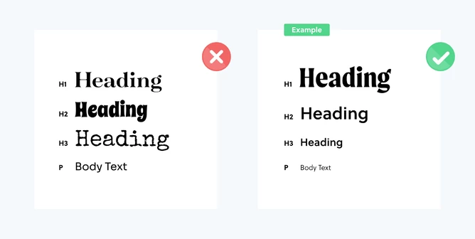
For readability and hierarchy, there should be a contrast between the typefaces used for the header and the body content. The body text fonts must be simple to read because this is where the bulk of the material will be found.
The readability of your site will also improve as a result of routinely using different font sizes to emphasize different parts of your content.
Utilizing three to six distinct font sizes is typical, determined by the size of both the web you are developing. Traditionally, main headings should be the greatest in magnitude or weight, followed by sub-headers, and body/paragraph content should be the smallest.
3. Excessive usage of centered text and a lot of text
On a website, large volumes of centered text not only appear disorganized but are also difficult to read and comprehend. Books, periodicals, journals, and blogging all utilize left-aligned text for a purpose.
Utilize left-aligned body text as much as possible, and use subheadings to divide your information into easily digestible chunks.
If there is no need for subheadings, divide your work into paragraphs with enough space between them to make it simpler for the reader to scan through long passages of information. If at all possible, avoid using long sections of text, but there are times when it is unavoidable.
4. Long line distances
The amount of characters in some kind of a line of text is referred to as the line length. Having too many lines in your paragraph text is a typical error. In addition to making it harder to read, it also makes a website less visually attractive.
A line should ideally be between 50 and 75 characters long, according to recommendations.
5. The number of buttons and consistent
The use of icons is one of the essential components required to browse a website.
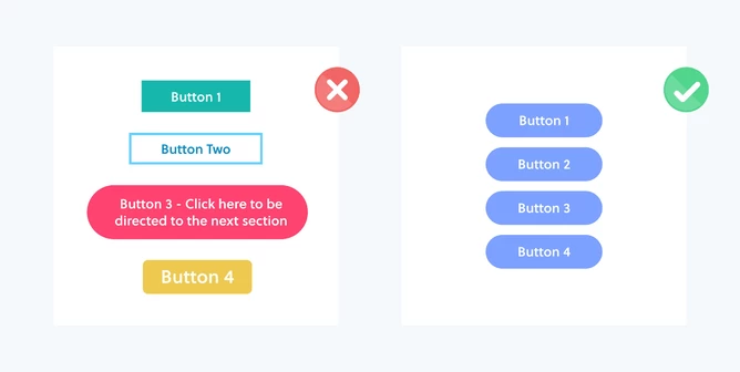
Consistency in button size, style, and color will enhance a website’s overall design look. Rocketspark provides independent button editing capabilities for a website’s desktop and mobile versions, so you never have to sacrifice excellent design.
Each call-to-action is more obvious when all of the buttons have the same appearance, which turns them into visual hooks of consistency.
When only protective measures needed to be taken, limit the number of icons on a website to a minimum. It is challenging for a user to focus exactly and they need to visit when a website has too many buttons.
To ensure that the call-to-action is crystal obvious and straightforward, it is wise to reduce the language in a button to a minimum. Use a phrase that is simpler, shorter, and yet to the point, such as “Contact me now regarding your query,” instead of “Contact me now.” For instance, “Get in touch.”
6. Bad photography and impersonal stock photos
On websites, photography is frequently a significant portion of the material. No matter how lovely your web design is, having poor-quality photographs will significantly detract from both its aesthetic appeal and its emotional appeal.
If there isn’t enough money or opportunity to undertake a custom photo shoot, stock photographs are an excellent approach to incorporating high-quality imagery into a website. Stock photography is frequently easy to identify as such. However, there are now some excellent commercial picture banks headquartered in New Zealand that provide distinctively regional, high-quality content from eminent photographers from throughout Aotearoa.
When it comes to photographs for your website, custom photography will constantly be the better alternative; thus, if you’re not a photographer and don’t have the necessary tools to take high-quality pictures, it’s well worth the money to developers from India. The price of building the website will increase initially, but over time the advantages will exceed the disadvantages.
Since you can customize the result, using bespoke photos makes a website more intriguing and unique.
7. Avoiding hierarchy
Your information and graphic components are prioritized according to their relevance, starting with the most important. On a website, for instance, the logo and navigation are displayed at the top, accompanied by the primary image and text that explains what the site is all about. It provides the visitor with the essential details about the company, allowing them to decide whether to continue browsing it.
A fundamental tenet of the way a user consumes material on a website is a hierarchy. When a person first views your website, you sometimes only have a few seconds to persuade them to stay. It’s crucial to utilize headers to group material into categories and to maintain consistency in your website’s color scheme and design to build logical passageways.
The visitor may become lost in a text and picture maze, making the website far less effective, as a result of a typical error in website design: failing to prioritize the important content items.
8. Content that is not properly spaced
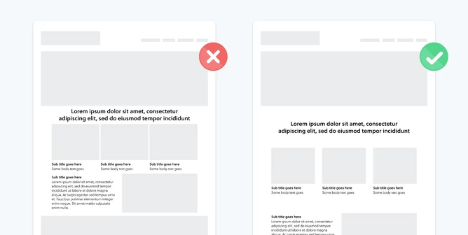
Site content should always be properly spaced, sometimes even more so.
Even if you have outstanding material that benefits the company or a commodity that the company sells, if it is jammed together, it will probably be ignored.
Content spacing aids in creating hierarchy and distinction between the many informational areas of a website. Your content’s accessibility can be boosted by up to 20% by using the right spacing.
Use space as a crucial component of your website design without hesitation. This is also known as white space or negative space. Blank spaces between and surrounding text on a page are known as negative spaces. Additionally, a region of a picture that is not the main focus is referred to as negative space.
On a page, making space for what’s vital might assist focus readers’ attention. You can’t make a focal point if there isn’t room for it. Give your material the room to breathe it needs.
Wrapping Up!
Your company’s website may be its most valuable asset, therefore you must make it perfect to make a good first impression. But in order to achieve it, you must not make these web design errors.
Not to worry. These typical website design errors are quite simple to avoid and correct. The most difficult step is figuring them out. However, now that you are aware of these errors, you may simply prevent or correct them going the future.
Do you currently make any of the following web design mistakes? Do you have any further frequent website design blunders to add to this list? In this sense, you are required to full stack developer in India to minimize the mistakes while designing websites.