CTA buttons are buttons that appear on your website’s landing pages. They contain action prompts that encourage your audience to take immediate action. Your website uses CTA buttons to guide users towards conversion goals.
A call to action (CTA) is undeniably one of the critical elements of a webpage’s user interface (UI). As soon as visitors land on a web page, it pops out and compels them to take action. You can use the CTA to encourage the audience to take desired steps such as ‘subscribe,’ ‘sign up,’ ‘download,’ or ‘claim a free trial.’
There is no shortcut to creating an effective CTA button. This requires patience and a lot of testing. To help you out, we have compiled a list of 10 tips to help you make the best CTA buttons.
1. Use Clear and Concise Command
CTA text has to be clear, concise, and commanding.
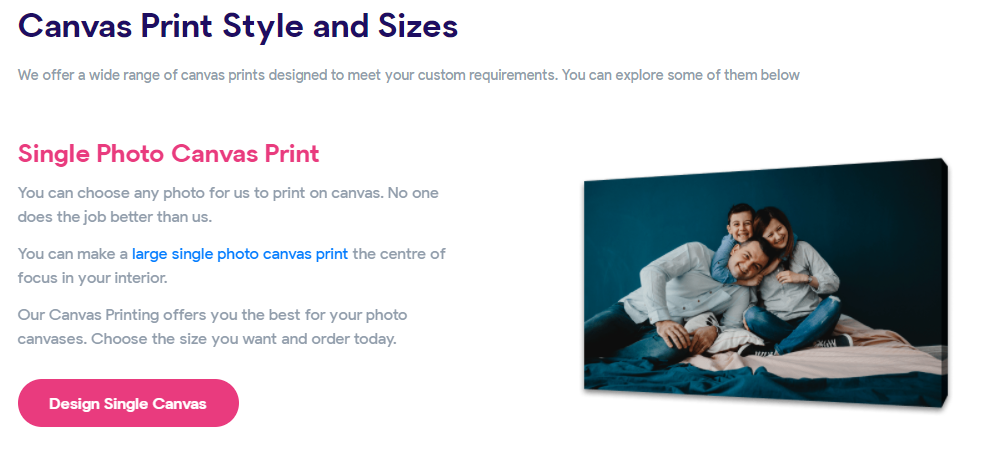
Avoid long phrases. Keep it brief and straight to the point like The Canvas Prints has done with all CTAs throughout their website.
Use words that directly convey an immediate action. Words like sign up, claim, grab, call, subscribe, follow, download, etc., clearly indicate what you want them to do.
The text must start with the commanding verb. It must convince your audience to instantly click and take action. For instance, “Avail 25% discount today” sounds more actionable than “25% discount ends today”.
2. Use Persuasive Text
The CTA button must have compelling text. It should evoke emotions in visitors and tell them what they can gain from clicking on them. Indirectly, you should relate your unique selling point to their feelings.
It’s clear you want them to take action in your CTA, but why should they? Define the ‘why’ for them.
Free consultations on wedding photography websites, for example, seem emotionally appealing. The user would get to discuss their story, vision board, wedding themes, etc., with the photographer during the free consultation. So, there is a greater likelihood of customers reaching the end of the sales funnel.
3. Make Sure Your CTA is Responsive
Mobile devices make up for half of the website traffic. Due to accessibility, convenience, and innovation, more people use mobile devices to access the internet. Sites with only desktop interfaces are miserably failing as users cannot navigate with their preferred devices.
In fact, a mobile-friendly CTA button will help you reach a wider audience. A responsive CTA button also fits and looks good across all screen sizes. Users can access it no matter what screen size they are using.
The mobile-enabled CTA also allows users to take immediate action, such as ‘Call Us’ or ‘Share on Facebook/Instagram.’
4. Add Images
Images also have an impact on engagement and conversion rates. An attractive background image makes a CTA button stand out more. However, ensure the CTA button is not obscured with an image cluttered with too many elements.
Images should be relevant to your services and the emotions of your customers. According to Stock Photo Secrets, websites generally perform better with images showing human faces and directional cues. You can use a picture with a direction cue towards the CTA button.
5. Pick the Right Colors and Shapes
Although a specific color does not guarantee more conversions, it does play some role in the process. Using attractive colors will also make your CTA button stand out from the rest of the elements and content. The audience will immediately see it as well after landing on the page.
The most common colors for a CTA button are red, green, orange, and blue. However, no color is more rewarding than the other. Their effectiveness varies with different industries, cultures, and contexts.
The CTA button’s color should be consistent throughout the website regardless of your color. Keep it louder and more vibrant than the color tone of the rest of the page. In the case of multiple CTAs, use the same color for all CTAs.
Most CTA buttons are rectangular with rounded corners. Recently, ovals and circles have also become popular. Round edges and circular shapes catch the eye more than sharp edges. This is because our brains have to put in less cognitive effort to process rounded figures than those with sharp edges.
6. Keep It Noticeable
The size of user interface elements plays a critical role in designing a webpage. Elements with bigger sizes tend to be more noticeable as compared to others. It’s evident that a CTA button is where you want the user to eventually land. So, you should make it big enough to grab their attention.
The audience should naturally land on your CTA button within seconds of their eyes scanning your copy. Yet, it should not be too big that it seems out of place or poorly designed.
7. Call for Urgent Action
A CTA must be a call for urgent action. Since the main goal is to instantly attract the visitor to take action, a CTA button has to create a sense of urgency. Visitors need to feel that they will miss out on your incredible offer, deal, or discount if they do not immediately click the CTA. Using words like now, today, or immediately in a CTA communicates that action must be taken promptly.
Using a specific time or number in the text has more chances of attracting visitors than a regular CTA button as well. Some examples of these include:
- Avail 20% discount today
- Claim your free trial in 2 days
- Don’t miss out on a 10% flat sale
- Free consultation for 24 hours
However, be wary of overcommitting and losing your customers.
8. Offer Fast Reward
Surveys suggest that 55% of users spend less than 15 seconds on a web page. It also implies that the CTA should not require more than a couple of seconds. The CTA should be quick, precise, and rewarding simultaneously.
Websites often design CTA buttons that direct users to fill out some form, making it more time-consuming. On the other hand, studies already show that users will not spend much time on a website and filling out these forms. So, such websites fail to reach their goal of conversion rates through CTA.
A typical CTA button will request newsletter signups, email subscriptions, text messages, etc. Most people skip CTA because they are afraid of getting flooded with emails and newsletters. It is better to use a CTA button that offers a higher reward for entering the sales funnel rather than the one above. Direct visitors to your services with more rewarding CTAs such as “Try the free trial for a month,” “Start your project today,” “Call us now.”
9. Place it Above The Fold
Most of the vital information of a website is kept above the fold. This is the information immediately visible to users when they visit a website. Hence, it leaves a memorable impact on them. When you keep CTA above the fold, users don’t have to scroll down to find it and take action. The process of them taking action becomes faster.
As mentioned earlier, the CTA button should require less effort from the users’ end. They will probably not spend time searching for the CTA button. Research shows that users spend 80% of their time viewing information above and only 20% below the fold while visiting a web page.
If they scroll beyond the fold, they might get distracted by other features on the page before reaching the below-the-fold CTA button.
10. Let the CTA Have Enough White Space
The blank space between various web page elements is known as White Space. It is also referred to as ‘Negative Space.’ It’s crucial to readability, balance, appearance, and overall user experience (UX) of the page.
Generally, the more white space there is, the more noticeable the elements. Hence, CTA should be given enough white space to stand out among other factors. Leave sufficient white space around CTA to attract users’ attention to it and convince them to take action.
Conclusion
There is more to a CTA button than simple text and design. The main goal is to get visitors to convert. That’s why understanding your audience is crucial to creating an effective CTA button.
Users won’t stick around for too long on a webpage. Therefore, CTA buttons must prompt quick, direct, and rewarding actions.